
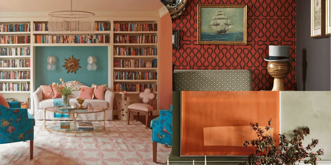
Nostalgia is one of the fastest-growing trends in home design. Many homeowners are bringing back colors, patterns, furniture, and design styles from the past. Some of the strongest returns are coming from the early 2000s.
Designer Suzan Wemlinger says the idea of “home” was once tied to how a space looked. “Today, home is described as how it feels—big difference,” she says. This focus on feeling is helping 2000s trends return to interior design.
Wemlinger says design trends often move in cycles. However, nostalgia is changing how these older colors are used today. “The colors are trending, but the ways they are used are not,” she says.
“Nostalgia also has proven health benefits,” says designer Renée Gaddis. “If a color combo or specific fabric reminds you of a past time in your life that has fond memories, it can be a very healthy surrounding.”
If you want to add a cozy and nostalgic touch to your home, these three color combinations are worth considering.
- Suzan Wemlinger is the founder and principal interior designer at Suzan J. Designs.
- Renée Gaddis is the principal at Renée Gaddis Interiors.
1. Red and Gold
“One color combination that so many homes had in the early 2000s was a deep red with gold,” Wemlinger says. “The reds tended to be warmer, with a blood-like depth to them.”
The gold shades were also specific. Wemlinger says they were difficult to get just right. They were more mustard than sunflower yellow, but they were not too muddy.
This color combination was common in many homes. Some rooms used the palette from wall to wall. Red walls, heavy draperies with swags and fringe, and jacquard fabrics with gold accents were popular choices.
“Artwork, vases, pottery, dinnerware often had the same color combination, so the room was loaded with this boldness,” Wemlinger says.
The look often leaned heavily into Tuscan style. For many people, Tuscan style is closely linked to 2000s decorating trends.
Today, red and gold are being used in a lighter way. The colors are often added as accents instead of becoming the main focus of a room.
“I’m seeing red and gold seep into design in small doses,” Wemlinger says. “The heaviness is gone, and the overly ornate is replaced with restraint,” she adds.
This approach also fits with the move toward a cleaner modern aesthetic.
Wemlinger suggests using red velvet or linen dining chairs with a burnished gold chandelier. Another option is a lacquered red accent cabinet with gold hardware.
She also recommends adding a simple pop of red to a subtle setting. This can help the color stand out without making the room feel too heavy.
“While not drama free–because red naturally lends itself to drama–it is more subtle,” Wemlinger says.
She also suggests using muted greens in rugs and furnishings. Burnished or champagne gold can be used in lighting and decor.
“Reds with muted greens in the rugs and furnishings, burnished or champagne gold in the lighting and decor brings the cycle full circle in a completely different way. This is what helps keep it fresh.”
2. Green and Terra-Cotta
Green and terra-cotta are another 2000s combination that Wemlinger sees returning.
“Green has a way of being a calming source, and in the early 2000s it was the answer for many who felt the red-gold combo was too much for them,” she says.
The colors were once used throughout the home. “There were olive green walls in one room, terra-cotta walls in the next, with accents of the opposing color throughout – in window treatments, furnishings and decor,” Wemlinger says.
The combination is still familiar today. However, the modern version is less bold and is used in smaller amounts.
The palette also works well with sophisticated boho and organic modern styles. These styles have helped bring earthy shades such as terra-cotta to the forefront of design trends.
To keep the palette from looking dated, Wemlinger recommends using softer shades and smaller doses.
“My advice for using this color palette today is to bring some lightness into the room—paint those walls a warm creamy white and let the furnishings and decor do the work,” she says.
One option is a muted olive green velvet sofa with a terra-cotta accent chair. Add a neutral rug and use a warm creamy white on the walls.
This approach keeps the 2000s color combination but gives it a more current look.
3. Teal with Rose Accents
Red and yellow were major colors in 2000s interiors. However, other bold palettes were also popular. These included pink, brown, green and blue.
Today, designer Renée Gaddis says teal and rose are returning as accent colors.
“They are used more as pops of color with a neutral base, instead of the way they were originally used in the early 2000s,” Gaddis says.
The colors can now be seen on furniture, area rugs, and artwork. Instead of covering an entire room, teal and rose are used to create smaller visual moments.
The original 2000s look often combined these bright colors with bold prints. Polka dots, stripes, and paisleys were common choices.
Today’s approach is more controlled and uses fewer patterns.
“Use the color combo as solid pillows and/or upholstery without so much print so it is more color blocking,” Gaddis says.
Why These 2000s Colors Are Returning
The return of these color combinations shows how nostalgia continues to influence home design. The colors may be familiar, but designers are using them in new ways.
Instead of recreating an entire 2000s room, today’s approach focuses on smaller accents, neutral backgrounds, softer shades, and cleaner styling.
This makes it possible to bring back favorite colors from the past while keeping the overall look fresh and modern.